
OsmAnd Maps is one of the most popular open-source alternatives to Google Maps. It has a lot going for it, but I can’t deny it’s not the prettiest app to look at. Thankfully, we can fix that — it’s very customizable.
I recently decided to give OsmAnd Maps a try, but I knew if I was going to give it a fair chance, I’d need to stop comparing it to Google Maps. The best way to do that was to make it look and feel more like what I’ve become familiar with.
Change the map color scheme
OsmAnd supports many different map styles
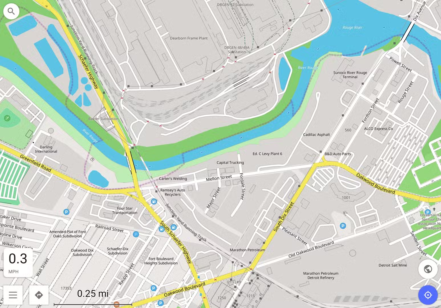
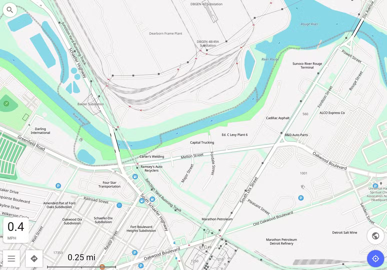
First and foremost, I did not like OsmAnd’s default map style. The vibrant, high-contrast colors are great for readability, but I prefer the “friendlier,” more subtle shades in Google Maps. Thankfully, OsmAnd includes a bunch of different map styles, and people can create their own as well.
I simply did a web search for “Google Maps theme for OsmAnd Maps,” and I came across a GitHub repository by FilipBB. They’ve shared over 25 custom OsmAnd map styles, including two directly inspired by Google Maps. “Classic Web Map” is the early Google Maps look, while “Modern Web Map” matches the current design.
Download the OSF file from the GitHub page on your phone. Then, to import the styles into OsmAnd, go to Maps & Resources > Local tab > Rendering style > Three-dot menu > Import. Select the OSF file, then check the box for “Resources” and tap “Continue.”
To apply the style, go back to the main screen and select “Configure map” from the menu. Scroll all the way down to “Map style” and select your desired look from the list. Note that you can use different styles for different navigation modes.
Configure the map and navigation screens
Make the UI more familiar
Changing the map style made a huge difference, but there’s more to Google Maps’ look than colors. I’ve come to expect certain things to be in certain places on the screen. Thanks to OsmAnd’s customizable UI, I was able to somewhat mimic Google’s layout.
The key menu to know for UI customization is “Configure screen.” This is where you can pick and choose what appears on the screen in different modes. For my purposes, I just wanted to tweak the main “Browse map” view and “Driving.” You can select the mode from the icon in the top right corner of the “Configure screen” page.
Here’s what I did. Starting in “Browse map” mode, I removed all widgets from the Left, Right, and Top panels. In the Bottom panel, I added only the “Street name” widget.” In the “Default buttons” list, I disabled “Configure map,” “3D mode,” and the zoom buttons. I created a “Custom button” for “Map source,” and selected “Microsoft Earth” as the source — this allows me to quickly toggle satellite imagery.
Next, tweaking “Driving” mode took a bit more effort. In the Left panel, I have the “Speed limit” widget. Nothing in the Right panel. The Top panel has three rows with one widget in each: “Next turn,” “Second next turn,” and “Lanes.” The Bottom panel has “Time to destination (Time to go)” in the first two, then “Distance to destination” and “Time to destination (Arrival time)” in the second row. For Default buttons, I turned “3D mode” on, and I created a Custom button to toggle voice prompts.
The little tweaks add up
So many customization options
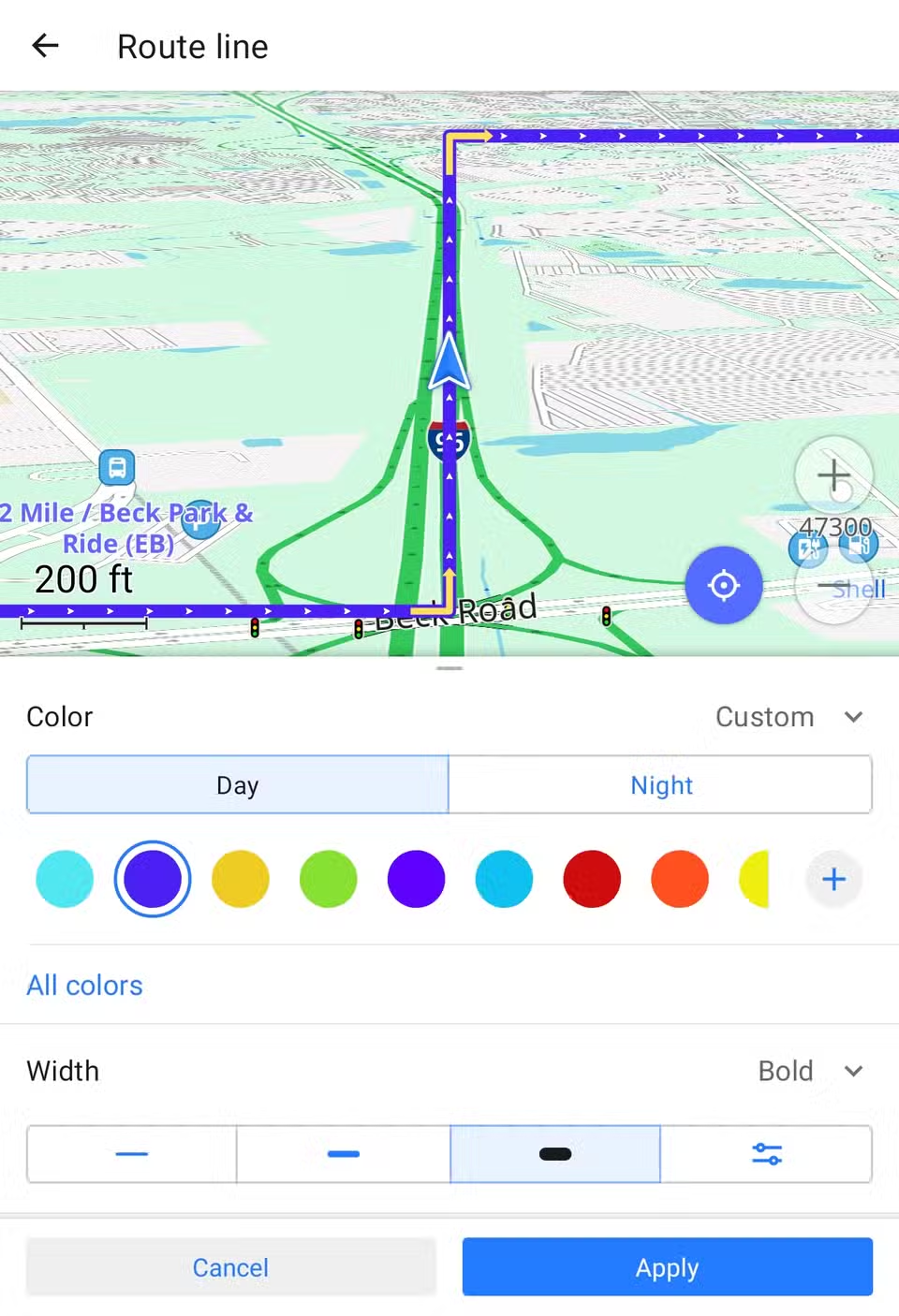
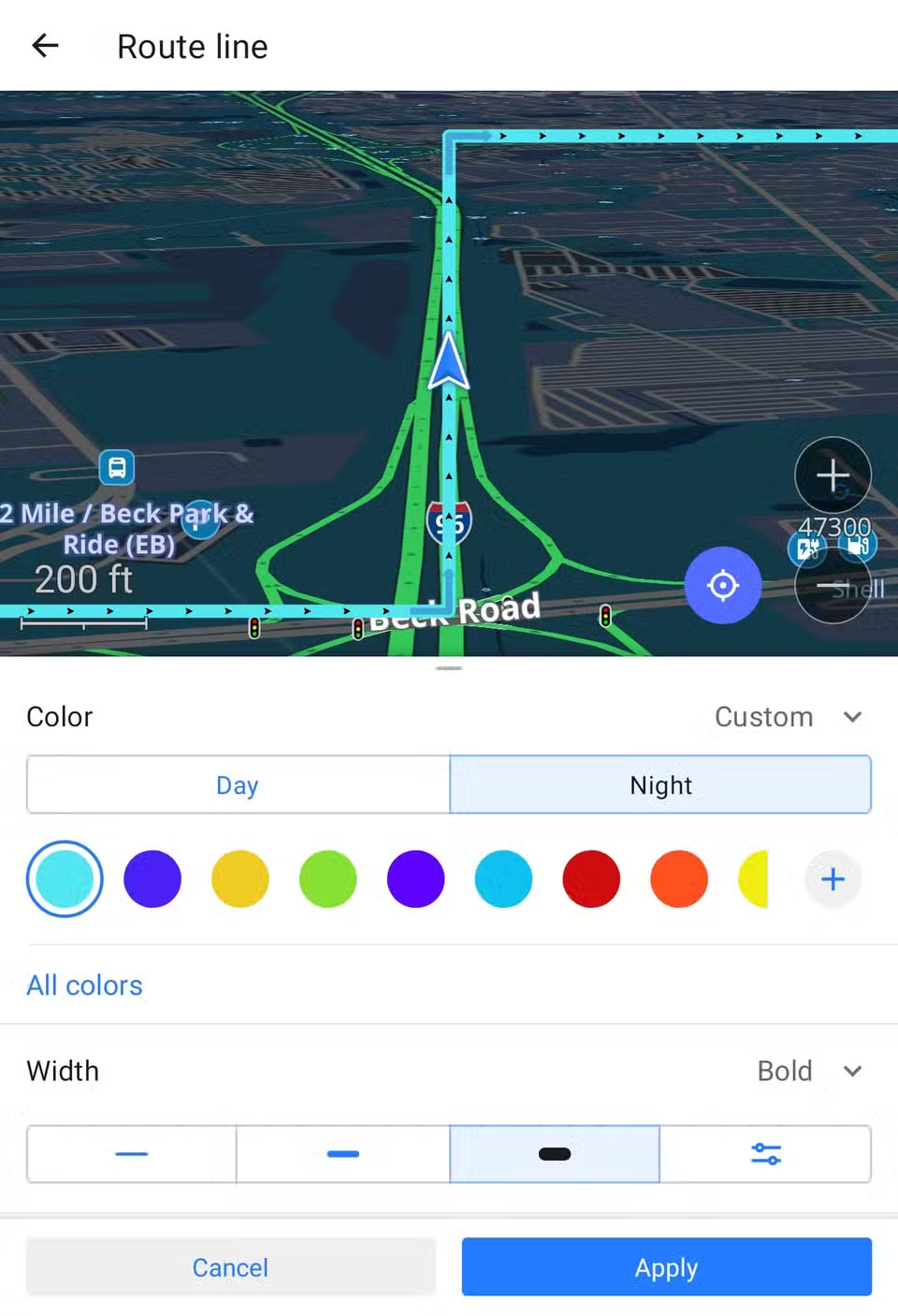
The map colors and UI configurations do most of the work, but there’s plenty of other opportunities to make OsmAnd feel a bit more like Google Maps. Here are a few other changes I made.
- For “Browse map” mode, I made the “Compass” button “Visible if the map is rotated.”
- In “Configure map,” turn on “POI overlay” for things like food, gas stations, cafes, stores, etc.
- In “Configure screen,” make sure to enable the speedometer.
- In “Navigation,” tap the settings icon and select “Customize route line.” Use #4c1df6 for Day and #4fe8f2 for Night.
I’m sure there are more things I could adjust to get the experience even closer to Google Maps, but this is far enough for me. The point was not to make OsmAnd Maps a 1:1 clone of Google Maps. Getting OsmAnd to a place that feels more familiar removes a lot of the friction that comes with switching to a new app. If you’ve been interested in giving it a try, these changes might help.